
Visual research summary
Graphical Abstract Maker
Create a publication-ready graphical abstract that turns your study question, method, and main finding into one clear visual story.
Create a graphical abstract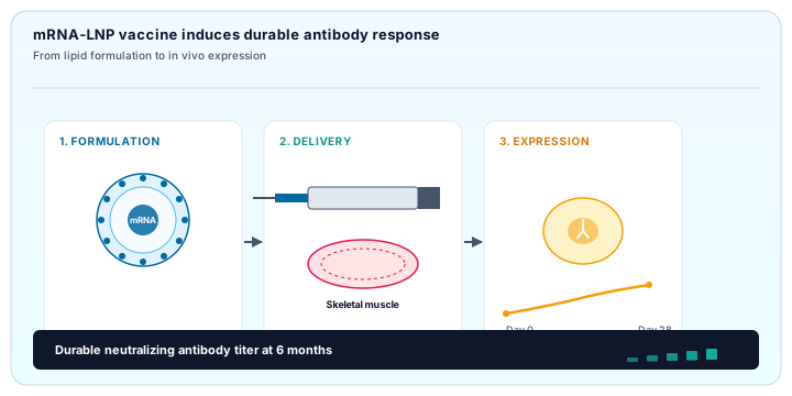
Visual research summary
Create a publication-ready graphical abstract that turns your study question, method, and main finding into one clear visual story.
Create a graphical abstractA graphical abstract is a compact visual summary of a research paper. It usually connects the research question, the main method or intervention, and the most important result with a small number of illustrations, labels, and directional cues. Unlike a decorative figure, a good graphical abstract has a beginning, a middle, and an end: a reader should be able to understand what was studied, how it was studied, and what was learned without opening the full manuscript. The format may be a horizontal sequence, a comparison, a process, or a central concept with supporting branches, depending on the story of the work.
Journals ask for graphical abstracts because editors, reviewers, and readers often scan many papers in a short time. A concise visual can make the scope of a paper easier to recognize in a table of contents, on a journal landing page, or when it is shared in a lab meeting or on social media. It does not replace the written abstract, the results figures, or the paper itself. Instead, it provides an accessible first explanation and helps the right audience decide whether the full study is relevant. The strongest graphical abstracts leave out secondary details while preserving the scientific relationship between the question, evidence, and conclusion.
Journal instructions differ, so the safest approach is to check the target journal before exporting. As a general requirement, a graphical abstract should fit the journal’s stated dimensions or aspect ratio, remain legible at the displayed size, and use a resolution appropriate for online publication and production workflows. Many teams work on a larger canvas and then test a reduced version so that labels, arrows, and symbols remain readable in a browser, a PDF proof, and a content-management system. Keep the final artwork clean, with generous spacing and a visual hierarchy that survives compression.
Common delivery formats include PNG, JPEG, PDF, and sometimes TIFF or an editable vector format. The exact choice depends on the journal and on whether the file is being used online, in print, or in a submission portal. Use a high-resolution export when the instructions allow it, keep text as text where possible, and avoid screenshots of a low-resolution canvas. Font size, contrast, line weight, color accessibility, and embedded fonts also deserve a final check. These are general publishing practices rather than rules for a specific journal; always compare them with the current author guidelines for your submission.
Start with the scientific story rather than the decoration. A simple outline makes it easier to decide what belongs in the visual and what should remain in the paper. The four steps below work for a new design, an editable template, or an AI-generated first draft that you plan to refine for submission.
Write one sentence that names the problem, system, intervention, or comparison your study addresses. Then write one sentence for the main finding. These two sentences are the guardrails for the graphical abstract. Select only the method details that explain the path between them: a sample, treatment, measurement, model, or analysis step. If a detail does not help the reader understand the conclusion, it can usually be removed or moved to the full paper. A prompt or rough sketch is often enough to begin an AI-assisted draft in the AI figure generator.
Choose a flow-style layout when the work has a clear sequence from input to result. Use a comparison layout when the central message is a difference between groups, conditions, or time points. A circular or feedback layout works for cycles, signaling loops, ecological systems, and repeated experimental stages. The structure should match the logic of the research, not the other way around. Starting from an editable graphical abstract template can help you test several visual grammars before you commit to one.
Use one visual language throughout: similar line weights, a restrained palette, consistent arrowheads, and a clear label style. Draw attention to the main result with scale, position, or contrast instead of adding more colors everywhere. Keep annotations short and place them close to the object or process they describe. If a pathway has many names, show the relationships first and move secondary terminology to a small legend. The SciDrawer templates provide useful starting points for balancing icons, labels, and whitespace.
Review the design at full size and at a reduced preview. Check that the first reading path is obvious, all text is legible, arrows do not cross labels, and the conclusion agrees with the written abstract. Export the format and resolution requested by the target journal, and keep an editable source version for later revisions. You can use the generator to make a new draft, compare variants, and prepare a high-resolution starting image before final editorial cleanup.
Examples are most useful when they are read as design decisions rather than copied as decoration. The four studies below use different visual structures, but each keeps the research question and conclusion easy to locate. They also demonstrate why a graphical abstract should be edited after the first draft: the goal is not to show every experimental detail, but to make the central claim memorable and accurate.

This example uses a left-to-right three-stage flow: formulation, delivery, and cellular response. Repeating panel proportions create a predictable reading path, while the final protein-expression result receives the strongest visual emphasis. The layout works because each panel answers one question and the arrows explain the relationship between them.
The connected panels make a complex study feel sequential without turning it into a dense protocol. A limited palette separates stages, not individual concepts, so the reader can understand the story before reading every label. This is a useful pattern when the study combines an intervention, a biological mechanism, and a measured outcome.
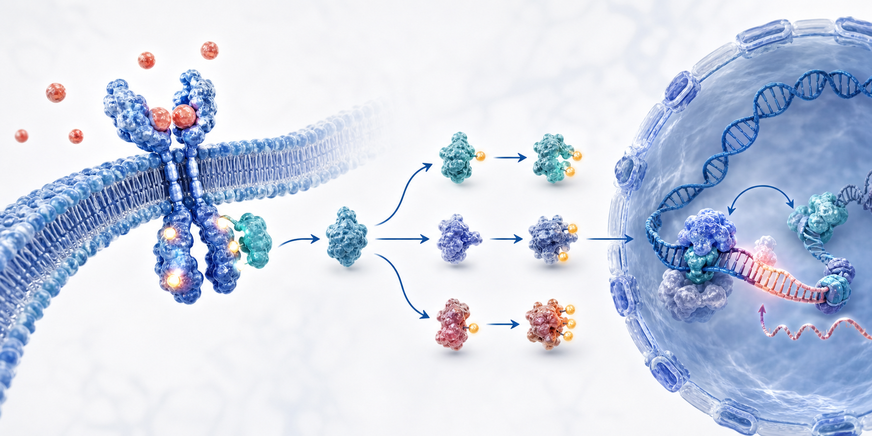
Here the membrane-to-nucleus direction provides the main axis. Arrows and spatial compartments carry the explanation, while concise labels prevent the pathway from becoming a paragraph. The design is effective because the viewer can follow the mechanism first and inspect the molecular names second.
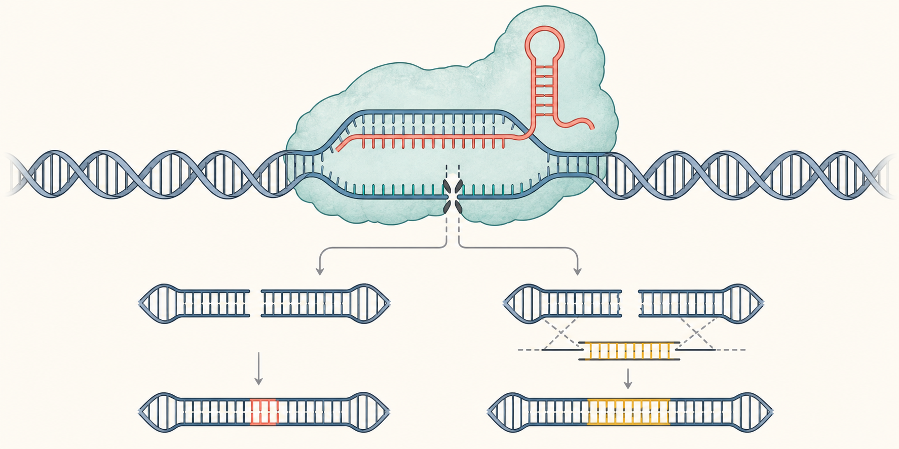
A workflow structure is appropriate for a design in which an intervention leads to a repair event and an observable result. The important choice is to show the before-and-after relationship clearly, then use small annotations to explain the intervention. That keeps the result from being buried under technical labels.
The most common problem is information overload. Authors often try to include every assay, control, gene name, and statistical result, which makes the visual look like a miniature paper rather than a summary. A better approach is to decide on one primary reading path and one primary conclusion. Remove repeated labels, combine related steps, and use a short legend only when it improves comprehension. A reader should be able to describe the story after a few seconds, even if they need the manuscript for the details.
Legibility problems are equally damaging. Tiny type, weak contrast, decorative gradients, and too many similar colors can make accurate science difficult to read. The graphical abstract should agree with the written abstract and the main figures; a mismatch in terminology or direction can undermine trust. Before submission, ask someone outside the project to explain what they see without coaching. Their questions will reveal whether a missing label, ambiguous arrow, or crowded region needs revision.
A template is most valuable when it gives the study a clear structure without locking you into someone else’s content. Begin with the scientific diagram templates to compare flow, comparison, and labeled layouts. A specific plant cell labeled diagram is useful when your work needs an anatomy-first visual vocabulary, while the graphical abstract layouts on this page are better for a question-method-finding story.
Once the structure is chosen, replace the sample labels with the terms from your manuscript and remove every placeholder that does not apply. The full template library is a quick way to explore alternatives, and the [SciDrawer home page](/) explains how the same workflow can support papers, posters, and presentations. When the story is clear, open the AI generator to make a customized starting point from a prompt, sketch, or reference image.
You can start exploring SciDrawer and create an initial draft with the available free usage. Paid plans provide additional credits and generation capacity when you need more iterations or higher-volume work.
Yes. Treat the AI output as a starting point: refine the prompt, use a sketch or reference image, and continue editing the visual for accurate labels, terminology, and journal-specific presentation requirements.
You can begin with a text prompt, sketch, or reference image. The final file format and resolution should follow the submission instructions of your target journal; check those instructions before exporting.
Yes. The design principles are language-independent. Replace the labels with the terminology used in the Chinese manuscript, confirm font support and readability, and follow the journal’s current file specifications.
A written abstract explains the study in sentences and usually includes more context and detail. A graphical abstract compresses the question, method, and main finding into a visual sequence that can be understood quickly.
A first draft can take minutes when the research story and visual structure are already clear. Allow extra time for checking labels, simplifying the composition, and matching the target journal’s requirements.
SciDrawer can produce high-resolution starting images. Before submission, confirm the exact pixel dimensions, resolution, color mode, and file-size limits requested by the journal.
SciDrawer offers free usage so you can test the workflow before choosing a paid plan. The amount of available generation depends on the current account and credit configuration.
Yes. A sketch or reference image can communicate layout, composition, or visual vocabulary that is difficult to express in words. Use it as a guide, then verify every scientific detail in the result.
When your research story is ready, turn the question, method, and finding into a visual draft with SciDrawer. Start from a prompt, upload a sketch, or provide a reference image, then refine the composition for your paper and journal workflow.
Open the AI figure generatorContinue from a focused template page, explore more research visuals, or open the generator when you are ready to make your own figure.