
Research poster workflow
Scientific Poster Maker
Plan a readable scientific poster from your research question, methods, figures, and results, then use AI to create a visual starting point.
Create a scientific poster draft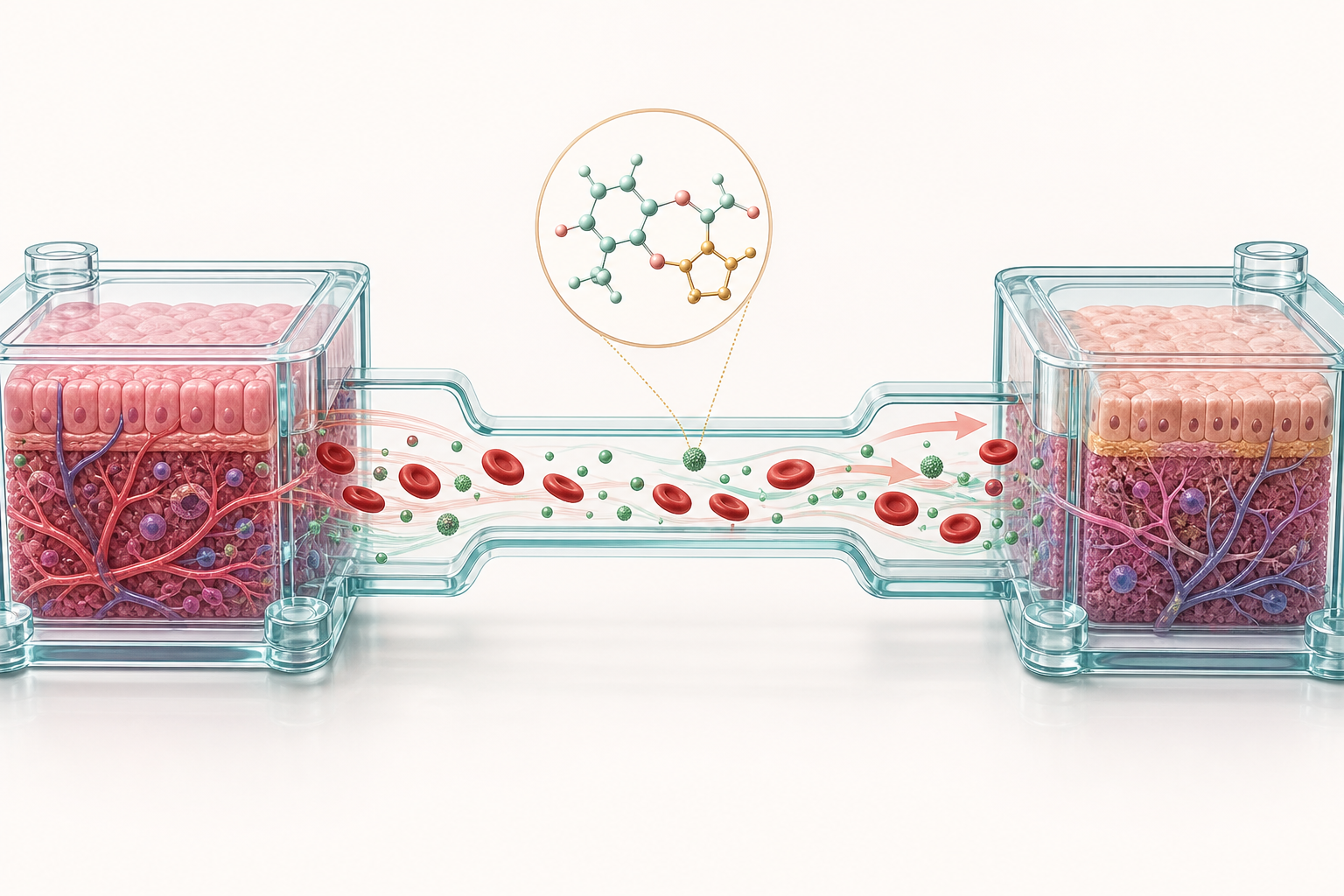
Research poster workflow
Plan a readable scientific poster from your research question, methods, figures, and results, then use AI to create a visual starting point.
Create a scientific poster draftA scientific poster is a visual presentation of a research project designed to be read while people are standing, walking through a session, or discussing the work with the author. It combines a concise title, a short introduction, methods, key figures, results, and a conclusion into a hierarchy that can be scanned from a distance and read in detail up close. A research poster is not a paper pasted onto a large canvas. It is a guided conversation: the layout should tell a visitor where to begin, what evidence matters, and what question to ask next.
A good scientific poster maker helps with the visual planning that happens before final typesetting. It can help you test a column structure, turn a dense method into a diagram, summarize the main result, and keep labels and colors consistent across sections. AI can accelerate the first draft, but the author still controls the data, wording, citations, statistical claims, and final export. Use the tool to explore structure and visual explanations, then validate every scientific statement before sharing the poster at a conference or online.
Poster instructions vary by conference, department, and venue, so check the current template and submission guide first. As a general practice, choose the final canvas size and orientation before arranging content, leave enough whitespace around each block, and make the title and central finding visible from the expected viewing distance. A clear grid is more useful than a decorative background. Use headings to create a predictable route through the project, and give the most important result the strongest position and visual weight.
Typography and figure quality matter as much as the text itself. Use a type size that can be read in person, keep line lengths short, and avoid filling every available space. Figures need enough resolution for the final canvas, with legends and annotations that remain legible when printed. Use color to group related information, not as a substitute for labels. These are general guidelines rather than a rule for a particular conference; confirm exact dimensions, file formats, accessibility requirements, and printing instructions with the organizer.
A poster becomes easier to design when the research story is reduced to a few decisions. The steps below help you organize the content before polishing the visual style.
Write the research question, the method that answers it, and the result that the visitor should remember. This short story becomes the poster’s visual spine. Keep background information only when it explains why the question matters. If the project has several results, select the one that best supports the poster’s stated claim and move secondary findings to a small supporting area or a linked paper.
A column layout works well for a conventional introduction-methods-results-conclusion flow. A story-board layout can be better for a multi-stage experiment, while a central-result layout gives one major figure the role of the visual anchor. Explore the template library before placing every paragraph. The right structure should make the project’s logic obvious even when someone reads only the headings and figures.
Replace long procedural descriptions with a workflow, mechanism diagram, or labeled structure when a visual can communicate the relationship faster. Use one chart or figure to answer one question, and write a short takeaway beside it. A prompt, sketch, or reference image can help the AI generator create a starting diagram, but numerical charts, statistical annotations, and final labels should be checked or rebuilt from the source data.
Read the poster from several distances and ask a colleague to summarize it in one minute. Check that figures are sharp, captions are understandable, citations are present, and the conclusion does not overstate the evidence. Export the requested format and inspect the generated PDF or image at the actual print scale. Keep an editable version so you can fix a label or adapt the work for a slide, paper, or graphical abstract.
The examples below are research visuals that can become poster anchors. Each one illustrates a different way to reduce complexity: a sequence of panels, a mechanism, a labeled structure, or a laboratory workflow. On a poster, give the anchor figure enough space to be understood without competing with every other element on the canvas.
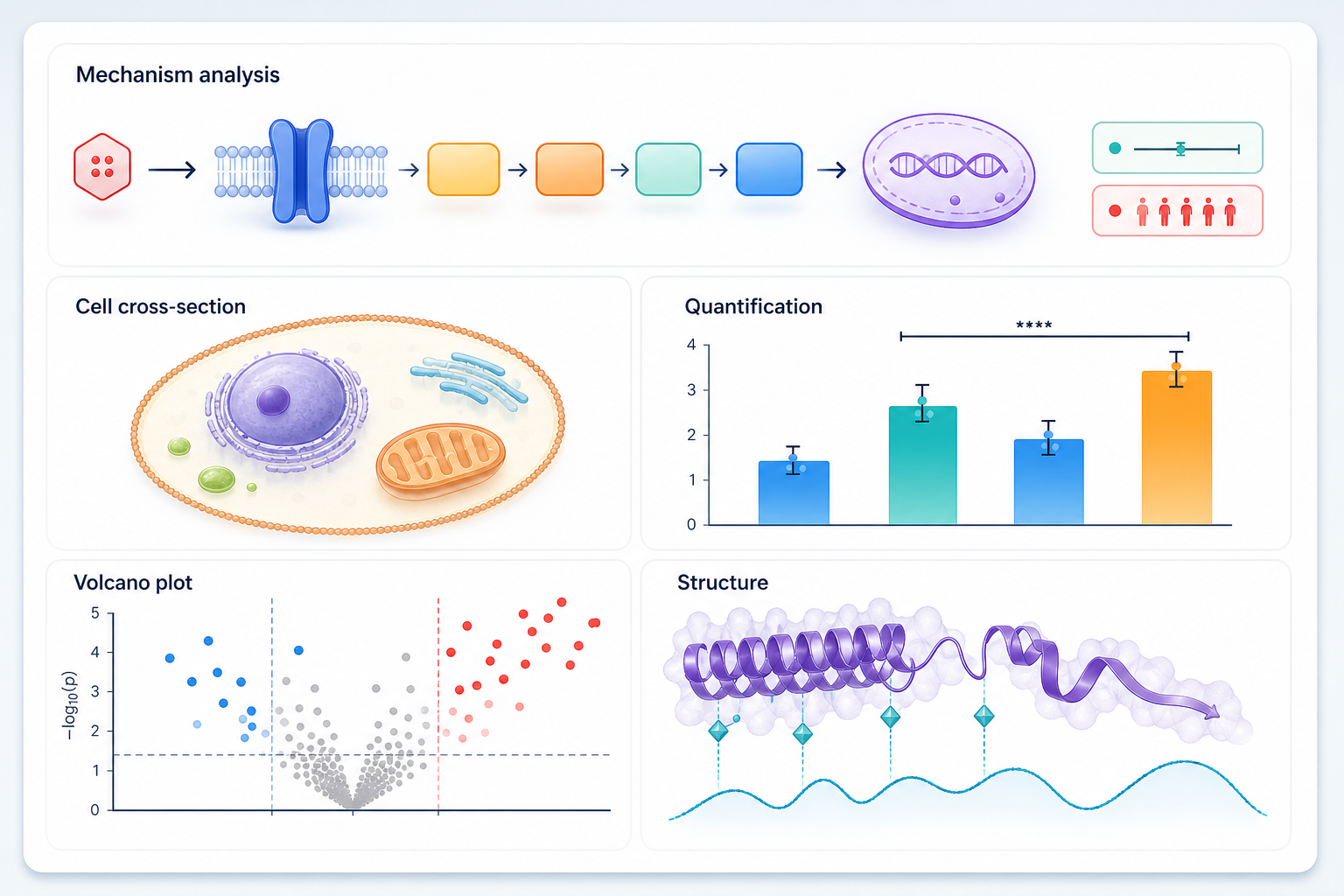
A mechanism figure can serve as the central explanation when the poster is organized around how an intervention produces a biological response. Use compartments and arrows to show the logic, then keep the caption focused on the finding.
A workflow is useful when the contribution is a sequence of fabrication, treatment, measurement, and analysis steps. Repeated panels help visitors locate their place in the process quickly.
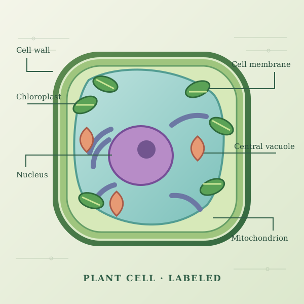
A labeled structure can support an introduction, teaching poster, or methods explanation. Keep the central object large enough to read, and use grouped callouts instead of filling the margins with disconnected labels.
The most common failure is trying to fit the entire manuscript onto the poster. Long paragraphs, tiny captions, and repeated background details force the visitor to stand too close and make the main result hard to find. Cut text before shrinking type. Use a figure, a short takeaway, or a spoken explanation for details that do not need to be read during the first pass. A poster should invite a conversation, not attempt to replace the full paper.
Visual inconsistency can create a second layer of confusion. Different figures may use different terms, arrow styles, color meanings, and levels of detail. Establish a small visual system and apply it across the canvas. Test the design in grayscale, check contrast, and make sure the conclusion agrees with the abstract and source data. A clean poster that says one thing clearly is more persuasive than a crowded poster that says everything at once.
Start with the scientific figure templates when you need a visual language for a method, mechanism, or result before building the whole poster. A plant cell labeled diagram can supply a clear anatomy layout, while the graphical abstract maker helps when the poster needs a compact question-method-finding summary. You can then use the AI figure generator to create an original figure from the details of your study.
The [SciDrawer home page](/) brings these workflows together for papers, posters, and presentations. Keep a copy of the poster source, exported figures, and final text separately so the work can be revised for another conference or adapted into a manuscript figure. Before sending the file to print, compare it with the event’s latest instructions rather than relying on a previous poster size or template.
You can use SciDrawer’s free usage to explore the workflow and create starting visuals. Paid plans provide additional credits when you need more iterations or higher-volume generation.
SciDrawer is best used to plan the visual structure and create research figures or drafts. You should assemble the final poster, confirm the data and wording, and follow the event’s submission requirements.
Yes. Use generated images and templates as starting points, then edit the layout, text, labels, charts, citations, and visual hierarchy in your preferred design or presentation workflow.
There is no single universal size. Confirm the required dimensions and orientation with the conference, institution, or printer before designing and exporting.
Yes. A sketch or reference image can guide the composition of a figure. Always verify that the resulting scientific content and labels match your source material.
Yes. Replace the copy with the conference’s preferred Chinese terminology, verify font support and readability, and follow its current size, format, and accessibility instructions.
A structured first draft can take a few hours when the figures and story are ready. Allow additional time for editing, data checks, proofreading, printing tests, and feedback.
SciDrawer can provide high-resolution starting images. Check the printer or conference requirements for final dimensions, resolution, color mode, and file format.
No. Generated figures require author review. Check every label, number, arrow, relationship, and claim against your data and manuscript before use.
Start with the question and result your poster needs to communicate. Use SciDrawer to create a figure draft from a prompt, sketch, or reference image, then assemble and verify the final poster for your event.
Open the AI figure generatorContinue from a focused template page, explore more research visuals, or open the generator when you are ready to make your own figure.