
Research diagram workspace
Scientific Diagram Maker
Create publication-ready research diagrams from a text prompt, sketch, or reference image, then refine the visual structure for your paper.
Make a scientific diagram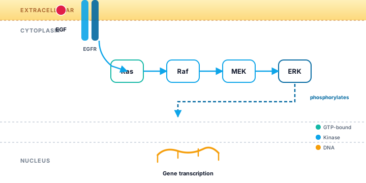
Research diagram workspace
Create publication-ready research diagrams from a text prompt, sketch, or reference image, then refine the visual structure for your paper.
Make a scientific diagramA scientific diagram is a visual explanation of a structure, mechanism, pathway, workflow, or relationship in a research context. It is more deliberate than a generic illustration: objects have scientific meaning, arrows describe a relationship or direction, and labels help the reader connect the visual model with the terminology in the manuscript. A diagram can show what a system contains, how a process changes over time, or how several components interact. The best diagrams reduce cognitive load without reducing the underlying science to decoration.
Researchers use diagrams in manuscripts, graphical abstracts, posters, lectures, grant applications, and lab documentation. A consistent diagram style helps the same study travel across those formats while keeping its terminology stable. SciDrawer is designed to help you move from a written description or rough sketch to a useful first composition. You remain responsible for checking the scientific accuracy, scale, direction, and wording before using an output in a publication or presentation.
Different research questions call for different visual grammars. Choosing a type before drawing helps the reader know what to look for and keeps the layout from becoming a collection of unrelated icons. The three categories below cover many common use cases, and they can also be combined when a study moves from a mechanism to a measurable outcome.
A mechanism diagram explains how an intervention, interaction, or biological event produces a change. Use spatial compartments to separate locations such as membrane, cytoplasm, nucleus, tissue, or device layers. Arrows should communicate activation, transport, inhibition, or transformation, while short labels identify the essential entities. Avoid drawing every molecule if the research question concerns a higher-level mechanism; a clear causal chain is more valuable than an exhaustive inventory.
A pathway diagram emphasizes sequence, branching, feedback, or convergence. It is useful for signaling cascades, metabolic routes, experimental workflows, treatment response, and data-processing pipelines. Establish a reading direction and use consistent arrowheads. If there are branches, align them to make the alternatives visible. If there is feedback, distinguish it from the main direction with a different line treatment or a short annotation rather than allowing it to cross the entire composition.
A labeled diagram identifies the parts of a structure, specimen, device, or model. It works best when the object occupies a stable central area and leader lines connect labels without crossing. Group labels by region, keep terms short, and use a small legend for repeated symbols. A plant cell labeled diagram is a useful example of how a recognizable structure can carry many labels while retaining a clear silhouette.
The fastest route to a strong diagram is to make the scientific relationships explicit before choosing colors or decorative elements. Use the workflow below whether you are drawing from scratch, adapting a template, or asking an AI tool for a first draft.
Write the one-sentence claim the diagram should support. List only the entities needed to explain that claim, then group them by compartment, stage, or role. This prevents a mechanism diagram from becoming a glossary and prevents a labeled diagram from hiding its main shape under text. A precise prompt that names the entities, relationships, and desired reading direction will produce a more useful starting point in the AI generator.
Use a left-to-right or top-to-bottom flow for sequential steps, a central object with callouts for labeled structures, and compartments or lanes for mechanisms that depend on location. A comparison layout is appropriate when the main claim is a difference between conditions. Browse the template library to see how a fixed grid, repeated panels, and consistent spacing can make a complex explanation easier to scan.
Place the major objects and arrows first. Check that the diagram can be understood in grayscale or with the labels temporarily hidden. Add only the details that change the interpretation: a receptor, a transport step, a control group, a measured output, or a key structural landmark. Use a consistent visual vocabulary for activation, inhibition, movement, and uncertainty, and explain any non-obvious symbol in a legend.
Compare every label and arrow with the manuscript, source literature, or validated protocol. Check whether the visual implies a scale, order, or causal certainty that the evidence does not support. Test the image at the final display size, then export the required file format and keep an editable version. For a figure that will later become a graphical abstract, you can also compare it with the graphical abstract maker workflow.
A useful example is not just a picture to imitate; it shows how visual structure carries meaning. These references cover anatomy, mechanisms, pathways, and laboratory workflows. Notice how each one establishes a dominant reading path and uses labels as support rather than as the entire explanation.
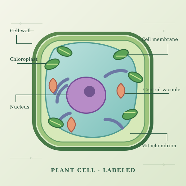
The central cell silhouette creates a stable anchor for the labels. Leader lines point outward, so the text does not obscure the organelles, and the recognizable outer boundary makes the diagram readable before every term is inspected.
The pathway view separates stages into a horizontal sequence and uses arrows to show direction. This makes it suitable for communicating a mechanism without requiring the reader to decode a dense network of crossing lines.
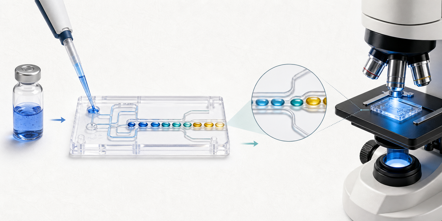
Repeated stages and consistent panel spacing turn a lab procedure into a compact workflow. The viewer can see the order of operations first and use the shorter annotations to understand what changes at each stage.
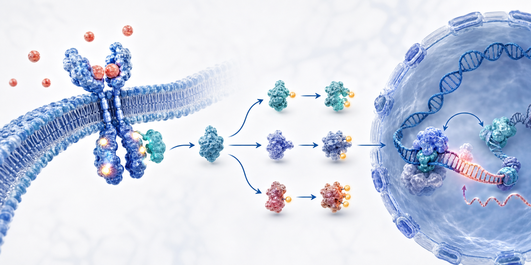
Compartment boundaries establish where the events occur, while directional arrows explain the transition from receptor activation to nuclear response. The layout keeps molecular detail subordinate to the mechanism.
A crowded diagram often indicates that the claim has not been narrowed enough. Adding more labels cannot fix an unclear relationship between the main entities. Start again with the claim, remove supporting details that do not change the interpretation, and use grouping or a second figure when two stories compete for the same space. The reader should know what is primary, what is supporting, and where the visual begins and ends.
Another frequent issue is inconsistent notation. An arrow that means activation in one area should not mean movement in another unless the legend makes that distinction explicit. Avoid relying on color alone, especially when the figure will be printed or viewed by readers with color-vision differences. Small type, weak contrast, crossed leader lines, and unlabeled abbreviations can make a scientifically correct diagram unusable.
Start with a template when you know the kind of explanation you need but do not want to spend time rebuilding a grid, label system, or panel rhythm. The scientific diagram templates provide a quick way to compare visual structures. For anatomy-first work, use the plant cell example as a reference for labels and leader lines. When the diagram needs to summarize an entire paper rather than one mechanism, the graphical abstract page offers a more narrative structure.
When the structure is clear, open the AI scientific figure generator with a detailed prompt, sketch, or reference image. You can use the [SciDrawer home page](/) to explore how diagrams fit into a broader research-figure workflow, then return to the template library to refine the composition. Keeping the same terminology and visual language across figures makes a paper easier to read as a whole.
You can create starting points for mechanism diagrams, pathway diagrams, labeled structures, workflows, graphical abstracts, and other research visuals from a prompt, sketch, or reference image.
Yes. Describe the entities, compartments, relationships, and direction of the mechanism. Always review the generated labels and causal arrows against your scientific sources.
Yes. A prompt that names the starting event, intermediate stages, branches, feedback, and final outcome helps establish a readable pathway structure.
Yes. You can specify the object and the labels you need, then refine leader lines, terminology, and layout before using the image in a paper or presentation.
Yes. A sketch can communicate layout and relationships, while a reference image can communicate style or structure. Use either as guidance and verify the final scientific content.
You can iterate with a revised prompt, sketch, or reference image and continue the design process in an editor or publication workflow for exact labels and final polishing.
They are useful starting points, not a substitute for scientific review. Check every label, arrow, scale relationship, abbreviation, and conclusion before publication.
Yes. Replace the labels with the terminology used in the paper, check font support and readability, and follow the journal or conference submission requirements.
SciDrawer offers free usage so you can test the workflow. Current generation limits depend on the account and credit configuration.
Describe the mechanism, pathway, or labeled structure you need and let SciDrawer create a visual starting point. Bring a sketch or reference image when the layout matters, then check every scientific detail before export.
Open the AI figure generatorContinue from a focused template page, explore more research visuals, or open the generator when you are ready to make your own figure.